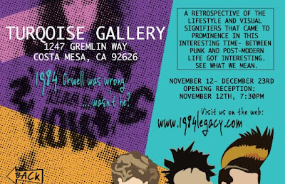
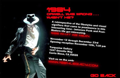
I just finished a critique for a new project, and wanted to post a few of my student's pieces.
The assignment was to create a "digital postcard" - 8.5" x 5.5" - for a hypothetical gallery exhibition. Final output was an InDesign file exported to interactive pdf with hyperlinks between the two pages, as well as a link to an external site (in this case, google). The idea was to create something that a gallery could send out as an email as well as print for traditional distribution. The subject for this was "1984: Orwell was wrong, wasn't he?" The exhibit would be a retrospective on the looks and styles of that year, 1984. Since most of the people in my classes weren't even born then (don't even get me started on how depressing THAT is), this required visual research to identify and understand the look and feel of that time.
Overall, I was pleased with the result, and wanted to post a few of the pieces for your viewing pleasure, and any comments you might want to make.
Here they are:
Designer: Pedro Cuevas
That's it for now - let me know what you think.


No comments:
Post a Comment