Monday, October 18, 2010

Vote!

Here's another project from my students at OCC.
The assignment was to create a 2-color (would print in 2 ink colors on a traditional printing press) poster to encourage people to vote. The poster needed to be non-partisan - not for any specific candidate or party. The size was 12" x 18".

I think the results looked pretty good! Let me know what you think.

Designer: Taylor Virgil

Designer: Mayuko Uemura

Designer: Ryan Spencer

Designer: Shirin Zand Vakili

Designer: Saba Anoushahpour

Designer: Justin Minosa

Designer: Rui Kajiwara

Designer: Fatemeh Davazda Emamizadeh

Designer: Morgan Brennan

Saturday, October 16, 2010

New Steve Cox Design - Up and Running! (sort of...)

Hey!

I've finally started re-designing my website (I think the last design was uploaded using punchcards), and have uploaded the basic site, with many, many, many more pages to come.

The obsessive-compulsive me didn't want to publish anything until the whole thing was complete and perfect. But, the pragmatic me won, arguing that anything was better than ye olde websighte of days gone bye.

So, look to your right at the Design Places I Like portion of the blog and click on the Steve Cox Design link. Check out my redesign and let me know what you think. If there's a horrendous typo pleeeeeze let me know - I do enough to embarrass myself and my family without adding to it.

If you're interested in the nerdville stuff, I will be posting a colophon page to give you info about the typefaces and images used in the design.

Cheers!

Wednesday, October 13, 2010

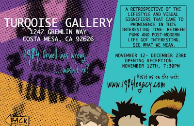
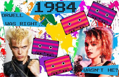
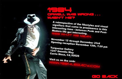
New Project: 1984 Digital Postcards

Hey!
I just finished a critique for a new project, and wanted to post a few of my student's pieces.

The assignment was to create a "digital postcard" - 8.5" x 5.5" - for a hypothetical gallery exhibition. Final output was an InDesign file exported to interactive pdf with hyperlinks between the two pages, as well as a link to an external site (in this case, google). The idea was to create something that a gallery could send out as an email as well as print for traditional distribution. The subject for this was "1984: Orwell was wrong, wasn't he?" The exhibit would be a retrospective on the looks and styles of that year, 1984. Since most of the people in my classes weren't even born then (don't even get me started on how depressing THAT is), this required visual research to identify and understand the look and feel of that time.

Overall, I was pleased with the result, and wanted to post a few of the pieces for your viewing pleasure, and any comments you might want to make.

Here they are:

Designer: Pedro Cuevas


Designer: Jeannie Park


Designer: Alyssa Kasparoff


Designer: Omar Ibrahim


Designer: Sander Wood (doing an excellent April Grieman impersonation!)


Designer: Kirstin Rogalski


That's it for now - let me know what you think.

Welcome to the Professor Steve Blog!

Welcome!
As part of my Massive Redesign of Everything Related to Steve Cox Design, I have created this blog to post rants/thoughts about design, and also to show off some of my students' work that I think is really nice, and worth a viewing. I hope you like what you see and read - it's definitely a work in progress for now, but it should improve shortly.

Bye for now!
-Steve